Collaborative Visual Art by The Beatles
I’ve always enjoyed learning little oddities and details about people, topics, and other things many probably don’t know, especially for subjects that are familiar to some extent to most. For instance, did you know that The Beatles had made a collaborative painting? I suspect most of you didn’t. To be honest, I can’t remember how I learned of this: I believe I was searching for a specific photo of The Beatles and stumbled upon this by complete accident. I’ve noticed that this subject doesn’t come up much, even among huge fans of The Beatles, which I suppose you could categorize me as such.
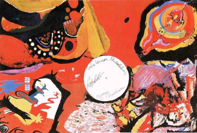
The above painting is titled “Images of a Woman” and is a thirty inch by forty inch piece made with oil paint and watercolor on paper. This piece was completed over a period of three days in 1966 in Japan when they were there to perform at the Budokan. Due to security reasons, they were sequestered in their hotel suite for a good portion of their time and needed something to occupy them. There is discrepancy reported in who provided them the art supplies: it has been said to either be their manager, Brian Epstein, or their Japanese promoter, Tats Nagashima.
The photos taken by photographer Robert Whitaker, who accompanied The Beatles during a significant portion of their touring years, provide some insight on how this painting was made. As you can see in most of the photos I have shared below, there is a lamp resting in the middle of the substrate that they are painting on. The base of the lamp is what had formed the white circle in the middle of the work. Seeing how the circle is noticeably not in the center of the piece and how their signatures in it are adjacent to the corner that they worked on, you can’t help but to wonder if John and Paul had hogged up the workspace and George and Ringo had less room to maneuver, if George and/or Ringo wanted more overhead light to better see what they are doing (and if we were to go by that theory, I’d say that applies more to the aforementioned member rather than the latter, seeing how the lamp was the closest to George’s corner), something else, or even them not even thinking that much or any about where the lamp was placed.
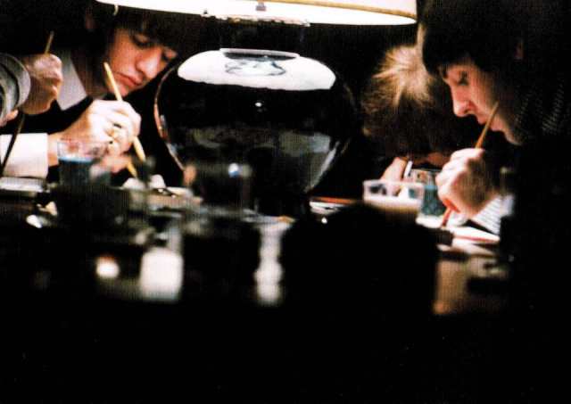
Something else I have observed is how they had added the background color after everything else. The photo immediately below best shows that: you can clearly see how blank canvas occupied the surface as they painted in their respective corners. I think most of you Path with Art painters have experienced how difficult it is to fill in the background of a painting, if you decide to paint the subject first. I am wondering if the use of watercolor paint factored into this choice, as it is a paint with low opacity, meaning that it doesn’t usually allow you to block out lower layers of paint entirely with subsequently painted layers like acrylic, oil paint, or gouache does.
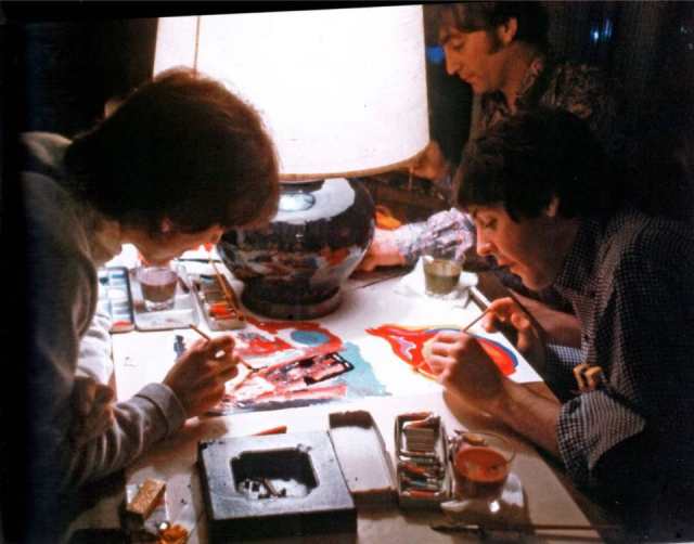
There’s not a good photo of John working on his portion (upper left of painting), which makes it a tiny bit harder to scrutinize his process. But what I find interesting is how clear it is to comprehend what he made. What I mean by that is that he struck me as the sort who planned very little, if he were told to be somewhere at a certain time, he would arrive at some point later, and had an all-around chaotic nature. But I suppose those who are often part of the chaos, and perhaps even perpetuate it, are often the ones who can make sense of it and find ways to refine it.
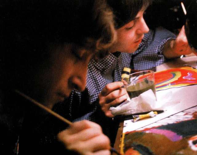
Paul’s corner (upper right of painting) doesn’t surprise me in the slightest in how it comes across as seeming the most planned and orderly. (After all, that sort of nature is a key contributor in what formed a rift farther down the line, but it was also what helped them keep on task earlier on.) It’s the corner the strikes me as being the most literal, too. (Though, John’s corner is the one that I’d describe as being the second-most literal, and for different reasons, but still running along the same vein as Paul’s section.) But by no means would I call his part plain or dull. It’s still aesthetically-pleasing.
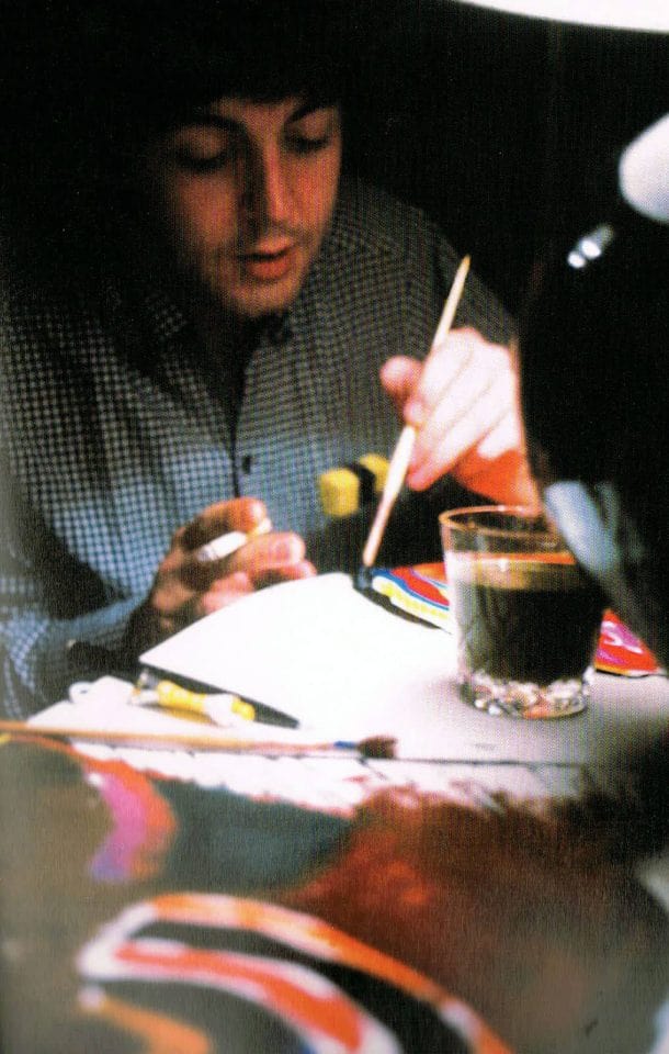
George’s piece (lower right of painting) is the portion I could hear a lot of people describe as being the most enigmatic. His portion has a painterly and sprawling quality that the other corners lack. I would perhaps describe it as being not corporal, which I can’t say that of the others. (And I would also say that that aspect makes perfect sense, too, not just visually-speaking, but who the artist was, too.) I wouldn’t describe it as complete and total chaos—there’s still a certain sort of cohesiveness and distinct flowing movement to it. It strikes me as having a base-level structure or plan that is improvised upon based on what George saw or found fit at that moment—kind of how I interpret how he functioned in general from what little I know of him (and I know him the most of all of The Beatles).
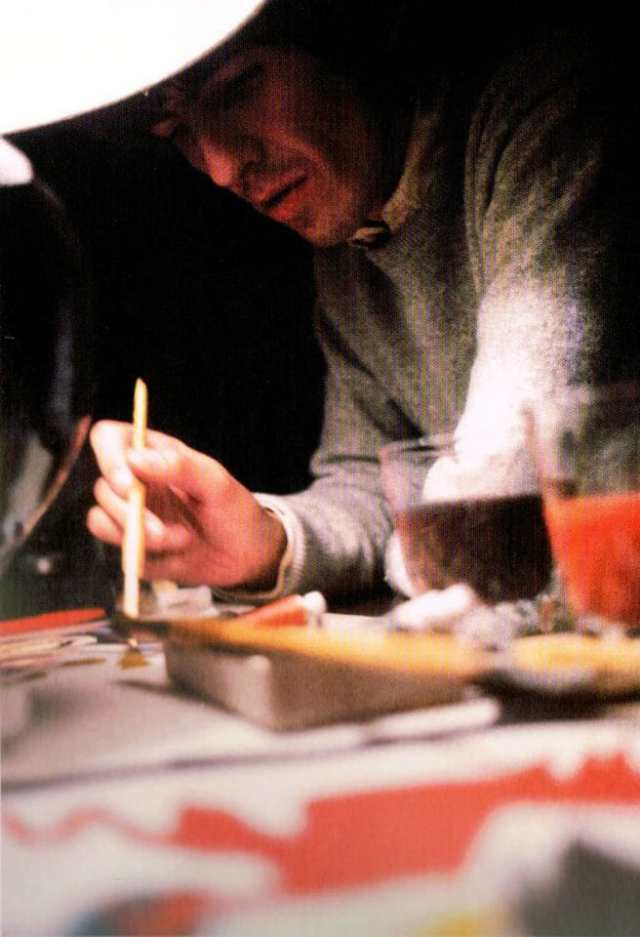
Ringo’s portion (lower left of painting) is probably my favorite. It’s probably the part of the painting that I actually find confusing on some level in terms of subject, but I like it despite that. I think describing it as methodical, but not insomuch planned, somehow seems apt. And it’s deceptively simplistic, in that the forms are strong and clear, but that aspect gives it a special sort of harmony that I can’t quite articulate.
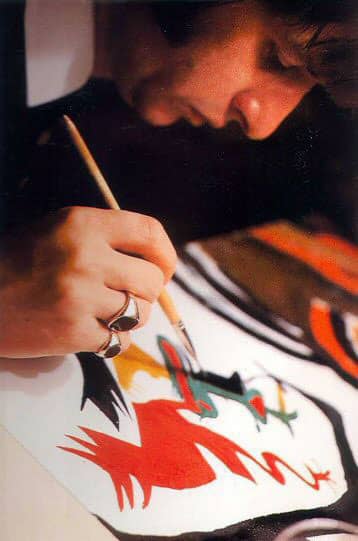
I wish I could find information as to how they selected their subject and who came up with the painting’s title. (Seriously, during any new interview conducted with Paul, someone should ask him some questions about this painting. So much of what people ask him has already answered a million times.) I’m curious if knowing such information would change my analysis of each segment.
Supposedly, creating this painting was something the four of them really looked forward to doing and perhaps even found the process therapeutic. Part of me is curious as to why they didn’t make more collaborative visual art pieces, apart from one other that I will mention a bit below, together. I suppose it was largely due to a lack of time. But if they had worked on numerous visual art projects, I suspect that tension would eventually develop between them with that task, too—after all, there seems to be more overlap to creating music and creating visual art than many probably realize. But then again, seeing how much painting “Images of a Woman” calmed them, maybe that would’ve lessened or prevented what turbulence eventually happened.
The history of whose hands this painting has passed through is interesting, too, including how the painting remained under someone’s bed for decades. Though, to be honest, I don’t find this part as intriguing as learning about the creation process and analysis of this work—I’m like that about visual art in general. I suggest reading the article from The Atlantic that I have sourced throughout this post, if want to learn more about its sales history and ownership.
As for the other collaborative piece I had briefly mentioned earlier, it was a drawing in colored pencil that they had made in 1967 known as “Peace To Monterey.” This piece was sent to the organizers of the Monterey International Pop Festival, an event that they regretfully were unable to attend (which is interesting, considering that Paul was one of the musicians who was involved in the festival’s genesis). There seems to be even less information out there about this piece than the one that is of primary focus for this entry, including its whereabouts. Unlike “Images of a Woman,” this piece doesn’t feel as if it initially started as something collaborative—it looks as if one of them might had been doodling during a moment of rest, and everyone realizing that it would be polite to contact the coordinators of the music festival decided this picture would be something nice to send, and the others added bits to it. If my theory is right, I can’t help but to feel that George was the one who started the drawing, as the primary subject (not objective) was more in his wheelhouse than anyone else; also, if you have ever seen any of the doodles John had drawn, this piece isn’t what I’d see as indicative of them (and this is even taking into account of how his latter drawings are looser in form than his earlier published drawings—honestly, I think his earlier stuff has a certain charm that his later stuff lacks, and this whole tangent would probably make a neat future blog post).
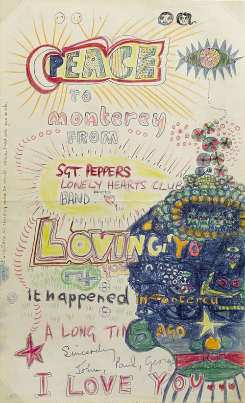
A point to mention about both pieces before I close out: I have yet to locate prints made of either of these pieces. I think “Images of a Woman” would make an interesting wall decoration and conversation piece, and would be a piece of fan memorabilia that strikes me as being classier than the usual sort of fare. I think if this work were more widely known, there would be enough fan demand for prints of these works to be financially lucrative.


Pingback: “When two inspiring art forms intersect, it gives you a remarkable feeling.” – Art Transforms